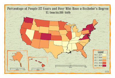
 I really liked the layout and color/background choices for this map. The neatlines around the insets and legend looks really cool, this is probably my favorite map of all.
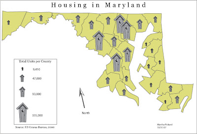 I picked this one because I really liked the symbols. They are very well made and are easy to distinguish.
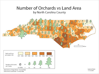 I chose this one because I really liked both the symbols and the layout, especially in the legend.
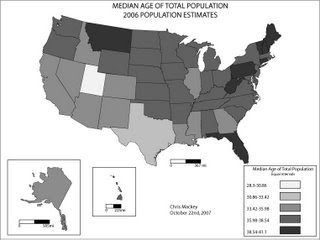 I picked this one because I thought for the black and white maps we had to make, it looked like one of the nicest.
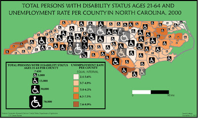
Here is another one of NC that I liked for both the layout and the excellent choice of symbols. The colors were also nice and helped to make this a nice map.

No comments:
Post a Comment