Tuesday, December 11, 2007
Monday, December 10, 2007
Wednesday, December 5, 2007
Extra Credit, Example Maps
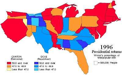 These type of maps are always fun to look at because they are such a stark departure from what we are used to looking at.
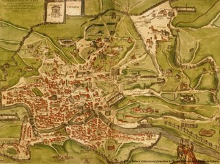 Another cool typography map, this is almost a work of art as much as it is a map. Very nice color choice as well as the neat look of the land in the map.
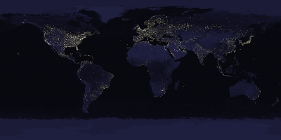 I always like looking at the earth at night maps, so it wasnt a hard choice to put this one in my favorite examples.
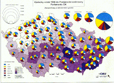 I like this map because of the proportional symbols and the fact that while in another language, the map looses nothing in translation because of how it was mapped.
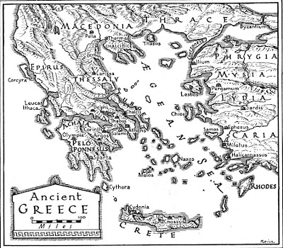 Very neat looking map, especially for the typography. Most of the interesting example maps I liked were very often typography maps.
Extra Credit
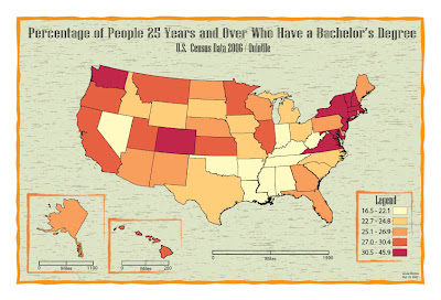 I really liked the layout and color/background choices for this map. The neatlines around the insets and legend looks really cool, this is probably my favorite map of all.
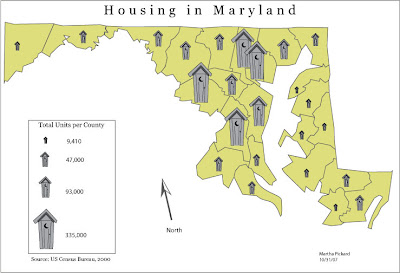 I picked this one because I really liked the symbols. They are very well made and are easy to distinguish.
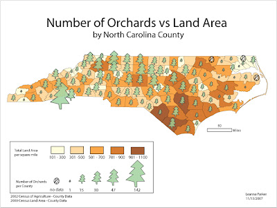 I chose this one because I really liked both the symbols and the layout, especially in the legend.
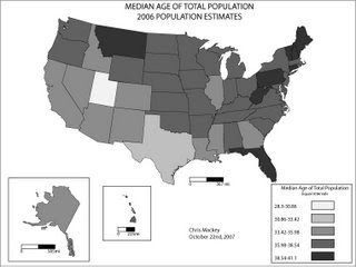 I picked this one because I thought for the black and white maps we had to make, it looked like one of the nicest.
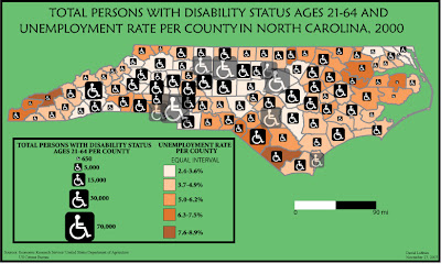
Here is another one of NC that I liked for both the layout and the excellent choice of symbols. The colors were also nice and helped to make this a nice map.
Subscribe to:
Comments (Atom)


